Wednesday, March 20, 2013

#9: Gas Pump Keypads

The fact that I can use my credit/debit card at the gas pump is super convenient. It saves me from having to go inside the gas station to pay. The only thing that irks me about this process is the keypad at most gas stations. It is usually a flat surface with the numbers written on it, and I am assuming that buttons are under this surface. It is shown below.
I have to use this keypad to enter in a zip code or a pin number. The problem with this input method is the feedback. There is no tactile feedback. Most buttons are 3D so I can feel the button being pressed for sure. With this keypad, I am never sure if I pressed it too soft or maybe even too hard. Sometimes I worry if I press it too hard that the neighboring numbers will also register. I am also not sure if I am pressing the number in the exact right spot. Additionally, there is usually an attempt at auditory feedback, but the beep that occurs when I press a button is too quiet to be heard at a gas station. I can look at the screen after each number I enter, but that is annoying and can be hard outside with the sun. I like the keypads below where there is plenty of tactile feedback. I understand why gas stations use the first technique though because customers have dirty hands and things might get in the buttons causing them to be sticky or malfunction. An ideal solution would be a 3D keypad with a good button protector.

Wednesday, March 13, 2013

#8: Bike Racks


The black curvy bike racks serve a great purpose of giving something cool looking secured in the ground to lock my bike to, but they frustrate me because they are not intuitive. I am not sure how to place my bike in relation to the rack when I lock it up. Am I supposed to use a kickstand, put one tire over the low part, or simply rest the bike against it under the high parts? The picture above shows how people above feel the same way as bikes are utilizing the rack in different ways. I don't like how resting the bike against the rack is unstable. My bike often falls over when I just rest it against the rack, and the pink bike on the left has fallen over like mine does. While this rack is neat that it can be used in different ways, I prefer the rack below.
I like these gray bike racks better because it is clear how to use them. The design of this bike rack makes it obvious that a tire goes over that first bar and into one of the slots. (I am not sure what that blue bike is doing, maybe it isn't as intuitive as I thought) The slots are great because they hold the bike up, so there is very little chance of it falling over. I am also lazy, and these gray racks prevent me from having to ever use my kickstand whereas I use the kickstand with the curvy racks to ensure my bike does not fall over. 

Wednesday, February 27, 2013

#7: Alarm Clock

My past alarm clock was very simple. It just had the basic features. Setting an alarm, playing a radio, snooze, and that was about it. I decided to splurge and try using an exciting alarm clock when I was shopping for college before my freshman year. I saw this one that's pictured below. It had various nature sounds and a projector that shined the time onto the ceiling. I thought these unnecessary features were cool and was curious if I would actually use them. It turns out I have. The "Ocean" sound is very nice to wake up to. I also enjoy simply opening my eyes and seeing what time it is on the ceiling instead of turning over and looking at the clock face.
I hoped that since this alarm clock had more features, that it would be more user-friendly than my old simple one. This has not been the case. There are two main issues, the brightness and setting the alarm. The clock face is just too bright. My old alarm clock never bothered me with its brightness, but this clock is noticeably brighter. An alarm clock is one clock that you do not want to be too bright, but this one errs in that way. I usually cover the clock face with a sock or something so it doesn't bother me.

The second issue is setting the time of the alarm. Setting the alarm mode or turning it off is easy. To set the alarm time, I have to press those two small buttons in the lower right labeled "HOUR" and "MINUTE." The problem is that if I want to change the alarm for a five minutes earlier, then I have to press that little button 55 separate times. The same goes for setting the hour (press 23 times for one hour earlier). This is frustrating because these buttons do not press easily. My old alarm clock had one hour and one minute button, but they were easier to use. They were stand alone buttons that were easier to press, and if you held one down it would start to fast forward your selection. This allowed me to quickly get to a specific minute setting 55 minutes away. Maybe the alarm clock designer should have focused on perfecting the main uses of the product before thinking about additional features.

Wednesday, February 20, 2013

#6: The Palacard!

Most of my posts have been discussing design pitfalls, but I want to dedicate this post to a great object and system. I really appreciate my Palacard. It has very useful information on it, it has good uses, and it is easy to deal with. The information on this card is very relevant. It has my birth date, Furman ID, and picture. These are all great for any identification issues. I am pretty surprised the stores around here don't ask for a Furman ID when kids try to buy alcohol. The information that pleasantly surprised me is the phone numbers on the back of the card for important Furman departments such as public safety, the infirmary, and university housing. I was locked out of the tennis center once and had to call FUPO. I did not know the number but checked my Palacard and it was conveniently there. Below is the card y'all are familiar with. I blocked out my face because the picture is funny. People's pictures are actually a good source of humor because everyone picked different types of photos from high school.
One of my favorite features of this card is its versatility. This card can be both swiped and scanned by certain card readers outside secure doors. I do not know how it works. There must be something inside the card that communicates with a card reader because I do not have to take my card out of the wallet for it to work. This seems pretty fancy for a simple ID card, and it is definitely convenient. It took me a while to find this out though since a card does not afford it being read without swiping it.

This card is easy to deal with because it can used seamlessly around campus. The thing I like the most about how Furman handles these cards is that they are free to replace if you turn in an old one. It is like 20 dollars to replace a lost card, but completely free to replace a worn out one. Since the cards can wear down fairly easily, I have taken advantage of this free replacement, and it only takes a few minutes.

Thursday, February 14, 2013

#5: DH Microwave

The DH microwave is so simple. It is either old or cheap. Either way, I am surprised the DH has not purchased a different one. One of the odd characteristics of this microwave is that there is no turning plate inside it. Most microwaves nowadays have a plate that turns in order to evenly heat the food. This lack of a turning plate can cause specific parts of a food item to warm while others remain cooler. I will admit that the lack of a turning makes the cleaning of the inside of a microwave easier though. This picture shows that there is some food residue on the inside of the microwave, and I wonder if the lack of a turning plate makes food more likely to splatter.

Another bad design aspect of this microwave is how the user sets the microwave's behavior. Most microwaves have a keypad of some sort. This pad will have the ability to choose various presets. I usually use the keypad to enter a time and a power level. There are usually buttons with the ten digits on them so I can input a specific time or power level. This microwave's input mechanism is very simple. It is one dial with tick marks of seconds you can set it to. Setting the time is intuitive with this dial because a dial affords turning and the numbers on the dial are clear. This microwave lacks a power level setting which is important if a user wants to cook food at a certain power level so they do not burn it, etc.

The main issue I have with the dial is that it does not work until I turn it past the first tick mark which is 15 seconds. I have only used this microwave for heating small pastries like muffins and donuts, and the first time I tried to do this I became very confused. The microwave recommends heating these items for 7-12 seconds, so I tried turning the dial to just before the 15 second mark. For some reason the microwave did not turn on to heat my pastry. I tried setting the dial to 10 seconds a few more times but it kept not working. I finally figured out that I had to turn it past the 15 second mark and then count 10 seconds in my head until I needed to remove my pastry. This is not intuitive for low time settings, and the microwave's recommendation of 7-12 seconds is misleading. Below you can see the dial. On a positive note, notice how the handle clearly affords pulling open the microwave door.

Monday, February 11, 2013

I/O: Smartphone Brain Scanner

This article describes a brain scanner that can be used with smartphones and tablets across different platforms. The brain scanner is shown below along with the application on the mobile devices. This scanner is a "low-cost wireless 14-channel Emotiv EEG neuroheadset." A scanning system like this allows the scanning to be minimally invasive and continuously capturing data. Little attention has been given to continuous brain imaging within the personal informatics realm because traditional imaging methods are heavy, complex, uncomfortable, and lack mobility. These traditional methods include MRIs and PET scans. This scanner provides a way to more deeply understand brain activity outside of laboratory environments and in everyday settings.


Technologies that monitor brain function are called Brain Machine Interfaces, and their use has been limited by cost, setup, and mobility. This brain scanner offers a consumer grade neuroheadset along with in-depth real-time analysis on a smartphone or tablet. The scanner can perform functions such as 3D brain activity visualization, logging, brain state decoding, and data acquisition. The system gives bio-feedback with a 3D model of active cortical EEG sources as seen above. Just like most wireless devices, the main issue limiting its use is power consumption. The scanner can run for 7.5 hours with local data analysis but only 3.5 hours with online data analysis.

The authors tested the effectiveness of this scanner through two experiments. The first experiment tested if the scanner could differentiate between a participant thinking about tapping an object with a finger from the right hand or left hand. The system had an accuracy of 64%. The second experiment tested if the scanner could determine if a participant was being shown pleasant or unpleasant images. For 6 out the 8 participants, the system performed better than random. The authors conclude that this system can consistently capture simple brain patterns despite a fewer number and less accurate placement of electrodes than traditional brain imaging methods. This system provides a great step forward for continuously capturing brain activity in normal settings outside of a laboratory.

Reference: "A Cross-Platform Smartphone Brain Scanner." Jakob Larsen, Michael Kai Petersen, Arkadiusz Stopczynski, Lars Kai Hansen, Carsten Stahlhut.
http://personalinformatics.org/docs/chi2012/larsen.pdf

Wednesday, February 6, 2013

#4 "The Door"

If you are a computer science student at Furman or have spent any time in the second floor of the Riley academic building, then you know this door. This door has seen better times, but it is currently in the doldrums. It personally might be the most frustrating thing on Furman's campus currently. The main problem with this door is that it does not close easily by itself. This does not seem like a big problem, but it is since this door is supposed to always remain closed. When it remains open for more than about a minute, an extremely annoying siren goes off. This siren always scares me and catches me off guard when I am in the lab.
The problem must lie in the door handle mechanism. The part on the side of the door that goes into the door frame and moves when I turn the handle is what I will call the latch. This latch gets caught on the door frame's corresponding part. This causes the door to be propped open, and then the alarming siren goes off until someone hurriedly shuts the door in annoyance. The problem seems to be that this latch cannot smoothly slide into its proper spot within the door frame. If the friction could be reduced or the latch somehow built so so these parts slide past each other more easily, then the door would close more fluidly. It seems that this latch is backwards as shown in the picture below. Most doors I have seen have the bigger curve of the latch making contact with the door frame while closing, but this door seems to have the latch set up so it cups the door frame in a sense as it closes. I am not a door engineer, but I would assume that a door intended to remain closed would close very easily.
I have two additional comments about the door, one bad and one good. I wish there was a bigger window on the door. The window on the door is only an inch wide, so a person can barely see into the lab. It would be cool if there was a bigger window, so people could see the awesome computer lab we have here at Furman. There is one part of the door that I love though, the card reader. Card access is required for entry into the lab. I just recently found out that I do not have to swipe my card but can simply pass the card over the swiper. I found out even more recently that I do not even have to take the card out of my wallet but can simply pass wallet over card reader. This is awesomely convenient, and I feel really cool whenever I do this.

Wednesday, January 30, 2013

#3: A Few Library Qualms

Furman University's James B. Duke Library is beautiful. Walking out of it at night at seeing the chapel across those reflection pool is a great moment. I have many great things to say about the library. The things I like include: books, DVDs, wide range of study spaces, ability to socialize or study hard, and the whole attractive look of the library. Despite all of the great aspects of this place, I want to briefly address three things that bug me.

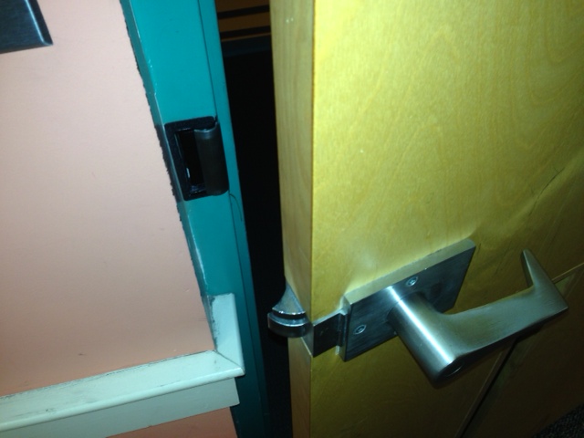
The first qualm I have with the library is the lack of an additional door. The library is very close to the Dining Hall and the University Center which are two of the most visited places on campus. People spend many of their days studying in the library and then taking a break by going to the Paladen or DH for a quick meal. Since the library only has a front door, students have to walk out the front of the library and then around the back of the library to reach their destination. A simple entrance and exit from the lower level of the library could be really useful especially during heavy rains and cold winter weather. It makes sense. Every other building on campus has multiple entrances, so that the building can be walked through essentially. Taken from the DH, this picture below shows where and how convenient an additional door could be.
The second qualm I want to address is the chairs in the study rooms. While the lower seat height bothers me, the main problem is how they rock. These chairs are not fully rocking chairs but they are definitely not sturdy either. I asked a friend about them and she said, "Oh my gosh, they scare me all the time as they suddenly rock while I'm focused on studying." I can be sitting in these chairs and it will suddenly start to move and I get this scared feeling like I am falling. These chairs are actually a big reason why I am not a huge fan of the study rooms. A library also is not the best place for these chairs because students love to rock into the wall. I often hear people in the rooms next to me rocking back and forth hitting the wall with the back of their chair. Another thing that bugs me about these chairs is that when I try to push them in, they just rock up instead of sliding forward.
The last quick qualm I want to mention is the inconsistency of outlets throughout the library. The tables and cubicles with the built-in outlets are great for plugging in my laptop. The trouble is that not all cubicles and tables have them. There is one row of tables along the right side of the library that has only a few outlets along the whole wall. As for the cubicles without the built-in chargers, my laptop charger does not reach the wall outlet, so I cannot study in these. I am just confused why the library did not purchase only tables and cubicles with outlets since students would be using their laptops often here.

Wednesday, January 23, 2013

#2: North Village Bathroom Towel Bars

First things first. The apartments in North Village have two different size bathrooms. Why does one side of the apartment get a bigger bathroom! Last year, I was lucky enough to have the bigger bathroom and did not experience the towel issues I have experienced this year. In the bigger bathroom there is a towel bar that is within easy reach from within the shower stall. That same towel bar is now rendered useless as shown in the picture below. Due to the smaller bathroom, the toilet is now directly underneath this towel bar making it useless for hanging long bath towels. A towel hung from this bar could cover the toilet, knock the things from the top of the toilet, or get tucked behind the toilet which is gross.


Furman does provide the bathroom with another towel bar; however, it is a good distance from the shower stall as shown in the picture below. The options for reaching this towel include stretching for it or stepping out of the shower. If I stretch for it, then I have to stretch far which creates the big risk of slipping in the shower. If I step out of the shower, then I get the tile floor wet. As I found out earlier in the year, this tile floor is extremely slippery when wet. Based on the design of these towel bars, Furman did not seem to take the user into consideration while placing these towel bars.

One possible solution would have been for Furman to move the towel bar that is over the toilet to inside the shower stall opposite the shower head. That is how it is at my home, and the towel surprisingly does not get wet while showering. The solution I resorted to is a 3M hook on the small sliver of wall by the shower. You can see this hook in the picture above. These hooks are not allowed in these apartments, and I am hoping that it does not rip off any paint. This hook has performed well and only fallen a few times from the weight of a towel. One solution that Furman could have employed is nailing a permanent hook into the wall here to hold towels. Regardless of what Furman could have done, my roommate and I took control of this situation and made our own solution. This 3M hook has worked well for the most part and allowed us to safely grab a towel from within the shower stall.

Thursday, January 17, 2013

#1: IPhone LifeProof Case


Christmas came and went, but the iPhone I received as a gift is here to stay thanks to the LifeProof case. LifeProof cases are known for the protection they offer phones especially in water. This case waterproofs the phone in water up to two meters deep! The design finds aesthetic beauty in simplicity. This is a good approach, since the simple design conveys the message that the case is here to do business and protect the phone.
Installing the phone in the case is very easy, and the case does a great job of providing feedback by clicking together to let the user know that they have fully secured a connection between parts of the case. One noticeable downfall of the case after installation is the presence of a bubble between the phone's screen and the clear layer of the case that goes over the screen. This makes it looks like it barely fits a little wrong. The main problem with this bubble is that it interferes with the interaction between user and phone. This bubble turns the touch screen into more of a "press" screen as the user has to push the clear layer down in some areas to make contact with the phone's screen. 
The other points of interaction besides the screen are around the side of the phone including the headphone port, charger port, and various buttons. The buttons such as ringer volume and power work great and are easy to use and provide tactile feedback when you have pressed them fully. The headphone jack is very unique. It can be a hassle sometimes because there is a screw-in cap that covers the headphone jack to make it waterproof. The hassle is whenever I want to use my headphones I have to unscrew this cap and screw in a special headphone adapter as shown below. Part of the hassle is keeping track of the small screw cap and headphone adapter. The small screw cap is also hard to operate because it has the small ribs on it which you have to use with your fingernails to screw in and out of the case. This small cap provides no feedback to let you know if you have screwed it in far enough to make the case waterproof. Since there is no feedback, I tighten this cap as much as I can which then leads to the cap being hard to unscrew! The small flap that opens to allow the phone charger to be plugged into the phone works great. It is attached to the phone and clicks shut when you close it. It would have been nicer if the headphone jack worked in a similar manner.
The case has a great design overall though because it accomplishes its main functionality of protecting the phone completely. The screwing headphone adapter makes sense in this aspect because it waterproofs the headphone jack when in use. The screwing headphone jack and bubble in the phone screen can be annoying at times, but this case's design is awesome because it accomplishes its main goal. It is quite amazing that this case can stop all water yet let sound travel clearly through the case, and these little nuances are worth having a phone with that kind of protection.